
Email Broken on Mobile: What to Check and How to Fix It
Seven symptoms, their causes and the order to fix them
Mailvex · 4 September 2026 · 5 min read
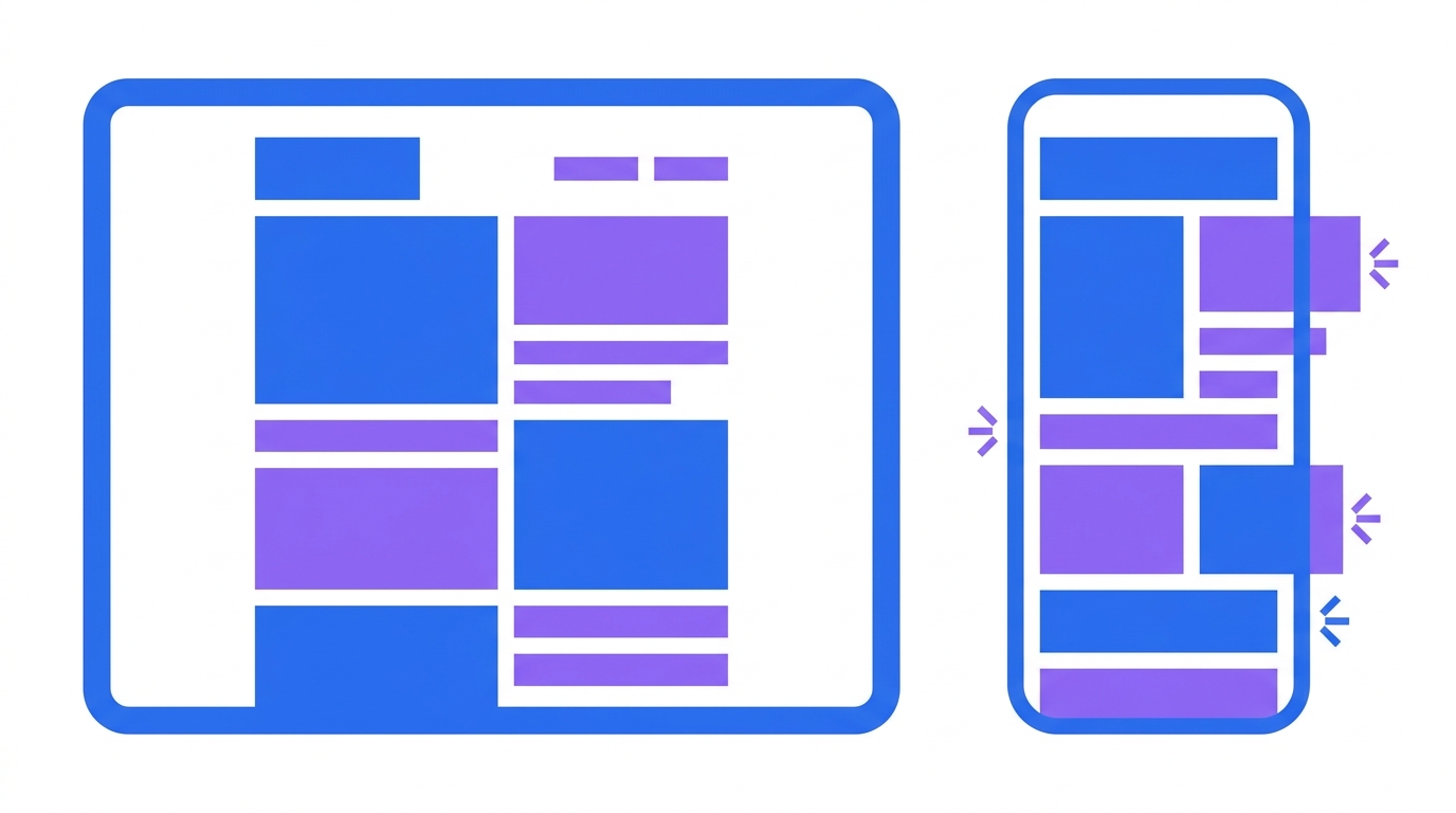
On a desktop the email looks right; on a phone the text shrinks, columns refuse to stack and the button runs off the edge. There are seven causes, and nearly all trace back to one thing: the layout was built for a wide screen and the narrow one receives it unchanged. Below are the symptoms, the causes and the order to fix them.
First, work out what exactly broke
Before fixing anything, work out what exactly broke. Opening the email on a phone and looking at the whole thing is not enough — you need to know which element misbehaves.
A practical trick: open the email side by side on a phone and a desktop. The difference shows up immediately, and you will see whether it is about size, layout or spacing.
It matters that some mobile mail clients do not support media queries at all. The code that reshapes the layout on a narrow screen simply will not run there. So the layout has to work before any adaptation, with the media query only improving it.
Seven symptoms and their causes
Seven symptoms cover almost every case. Find yours in the first column.
| Symptom | Cause | What to do |
|---|---|---|
| Text smaller than expected | fixed size below 16 pixels | set 16 and up; an iPhone scales anything below 13 and breaks the layout |
| Email wider than the screen | a hard pixel width | 600 on desktop, 100 percent on a narrow screen |
| Columns did not stack | block-based layout with no fallback | tables plus a media query, some clients ignore them |
| Button not tappable | height below 44 pixels | 44 minimum, 48 better, padding on the link itself |
| Images stretched | no width limit | max width 100 percent, height auto |
| Spacing fell apart | padding set on blocks rather than cells | move it onto the table cells |
| Email clipped | weight above the threshold | stay under 100KB, your platform adds its own code on top |
The first two rows occur more often than all the others combined. Especially the first — almost nobody writes about it, and the consequences are visible.
The iPhone font-size trap
The font trap deserves its own section because it is not obvious.
An iPhone forcibly scales up any font smaller than 13 pixels. It does this for readability and it cannot be turned off.
The problem is that the container does not change. The text got bigger while the space for it stayed the same — so it stops fitting. Lines break in the wrong place, the block grows downward, neighbouring elements shift.
Hence the rule: body text from 16 pixels, small text such as image captions no smaller than 13. Anything below that produces unpredictable layout on some devices.
The order to fix things
Fix the symptoms in a specific order — some corrections resolve several problems at once.
- font sizes first: 16 and up for body text, no smaller than 13 for fine print
- then width: 600 pixels on a wide screen, 100 percent on a narrow one
- then layout: tables instead of blocks, a single column by default
- after that buttons: height from 44, better 48, padding on the link
- spacing last: move it from blocks onto table cells
The order is not arbitrary. Font sizes affect block heights, width affects line breaks, layout affects everything. Start with spacing and you will redo it after every subsequent change.
How to test rather than guess
Checking the email in a browser emulator is not enough. It shows how a website would look at that window width, not how a mail client renders the email on a real device.
The minimum test is sending the email to yourself and opening it on a phone. Not in your sending platform preview, but in the actual mail app where the recipient will see it.
- open on a phone and scroll all the way through
- tap the edge of every button, not the centre
- view in dark mode: has the text merged with the background
- turn off image loading and confirm the point still comes across
- check that text fits its blocks without breaking mid-word
The second point matters most. Tapping the edge is what reveals whether the whole button is clickable or only the label — and that is the most common cause of lost clicks on mobile.
How a builder handles this
Most symptoms in the table arise because the layout is built for a wide screen and mobile receives it unchanged. The right order is the reverse: decide how the email looks on a narrow screen first, then add the wide version.
In Mailvex every block has its own settings for a narrow screen: separate spacing, font size, column order. The compiler produces tables with a media query, so the email still works in clients that ignore media queries. The preview switches between desktop and phone inside the editor, and a test send runs from there too.
Build an email that works on a narrow screen.
Browse templatesFrequently asked questions
Why is the text on an iPhone bigger than I set?
The system forcibly scales up any font smaller than 13 pixels for readability, and it cannot be turned off. The container does not change, so the text stops fitting and the layout shifts. Use 16 and up for body text and no smaller than 13 for fine print.
Is a browser emulator enough for testing?
No. An emulator shows how a website would look at that window width, while a mail client renders the email differently. Send the email to yourself and open it in a real mail app on a phone.
What if the columns will not stack into one?
Some mobile mail clients do not support media queries, so the code that reshapes the layout on a narrow screen never runs there. The layout has to work as a single column by default, with the media query only improving it on clients that understand it.