
Responsive Email: Why "Made for Mobile" and "Mobile-First" Are Different Things
Eight parameters, a media query and the iPhone font-size trap
Mailvex · 9 August 2026 · 5 min read
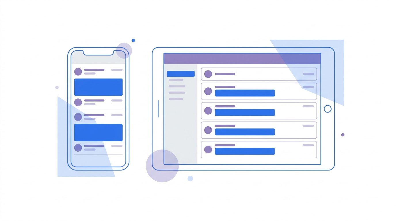
Responsive design and mobile-first are not synonyms. In the first, a layout is drawn for desktop and checked so it does not fall apart on a phone. In the second, the phone is designed first and desktop becomes an extension. The difference shows in the result: the eight parameters below are set differently depending on which path you took.
Two different strategies
The case for choosing is simple: most emails are opened on a phone, and the top client by opens is a mobile one.
around 46%
Litmus: Apple Mail share of email opensWhich leads to something many miss: if a layout is created at 600 pixels on a large screen and then squeezed, the decisions on a phone are made not by the designer but by the client rendering engine. Mobile-first reverses the order: you decide how the email looks on a narrow screen, then add the wider version.
In practice this changes three things: hierarchy, element size and word count. A phone has no sidebar, so the most important block goes to the top. Buttons are sized for a thumb from the start rather than shrunk from desktop. And the copy gets shorter — five hundred words on a phone is a burden.
Eight parameters that decide everything
These values are settled by practice and barely change between projects. They work well as a checklist.
| Parameter | Value | Why exactly this |
|---|---|---|
| Email width | 600 pixels | fits both the preview pane and a phone |
| Columns on a narrow screen | one | two columns on a phone force zooming |
| Body text size | 16 pixels and up | below 13 the system upscales it forcibly |
| Button height | 44 minimum, 48 better | the minimum in Apple and Google guidance |
| Padding from the edge | 16 pixels and up | text flush to the edge is unreadable |
| Text contrast | 4.5 to 1 and up | the readability threshold in bright light |
| Primary button | within the first 300 pixels | above the first scroll |
| Subject line length | 35–45 characters | longer gets truncated on a phone |
On buttons specifically. Apple guidance says a minimum of 44 by 44 pixels; Google says 48. It is sensible to take the larger figure: headroom never hurts, while a button too small on a phone gets missed by the thumb and irritates.
The font-size trap
Here lies a trap almost nobody writes about. The issue is not that small text is hard to see.
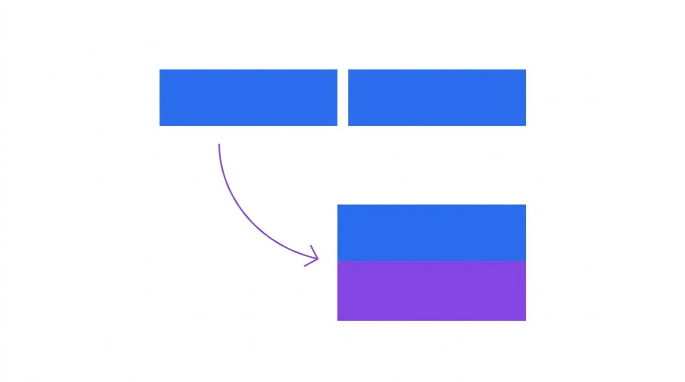
The minimum font size an iPhone will display is 13 pixels. Anything smaller gets forcibly scaled up to that value. The problem is that only the font scales while the container stays put: the text no longer fits, lines break in the wrong places and the layout shifts.
So a 10-pixel caption breaks the layout not because it is invisible but because the iPhone enlarges it without asking. Practical conclusion: never go below 14 pixels, even in secondary captions.
The code: stacking columns
Stacking columns is done with a media query. It gives elements full width on a narrow screen and simultaneously raises font size and button height.
Note the hiding class. On a narrow screen it helps to remove elements that do not fit: a long header navigation, decorative images, secondary footer links. Remove them rather than shrink them.
The Outlook problem
Media queries do not work everywhere, and the main holdout is classic Outlook for Windows. It uses a word processor engine and ignores media queries, so the email stays exactly as originally coded.
There are two solutions. First, build the email single-column from the start: nothing to stack, question closed. Second, the hybrid approach, where column widths are set with percentages and a maximum width at once and alignment comes from table attributes. Columns then reflow even where media queries do not run.
The hybrid method is sturdier but harder to set up. For most campaigns a single-column layout plus a couple of media queries covers the real cases.
What to check on a phone
- open the email on a phone, not in a narrowed browser window — they are not the same
- check whether the primary button fits the first screen without scrolling
- tap the button with a thumb rather than a mouse: do you hit it first time
- read the text outdoors in bright light — that is how contrast gets tested
- turn image loading off and confirm the meaning survives
- check the email in dark mode, which a large share of users have enabled
The bright light point is not a joke. Light grey text that reads perfectly on a monitor indoors disappears outside. The 4.5 to 1 contrast threshold exists for exactly this.
How this works in Mailvex
In Mailvex mobile values are set separately from desktop ones: every block can have its own padding, font size and alignment for a narrow screen. Column stacking happens automatically and the media queries are added at compile time.
The preview toggles between mobile and desktop inside the editor, and a test send to your own address is one click. That covers most of the pre-send checks.
Build an email and view it in the mobile preview.
Browse templatesFrequently asked questions
What is the right email width?
600 pixels is the safe standard. It fits the preview pane of email clients and scales down correctly on a phone. Anything wider than 640 pixels starts causing horizontal scrolling in some clients.
Do I have to use media queries?
Not if the email is single-column to begin with — there is nothing to stack. Media queries are for multi-column layouts, and even then they do not run everywhere: classic Outlook ignores them.
Why can I not use small text in captions?
An iPhone forcibly scales any font below 13 pixels up to that size. The container does not change, so the text stops fitting and the layout breaks. Keep a minimum of 14 pixels even in secondary elements.