
Bringing Every Email in Line with Your Brand: A System Instead of Manual Colour Matching
What transfers from a brand book to email and what has to be adapted
Mailvex · 9 August 2026 · 5 min read
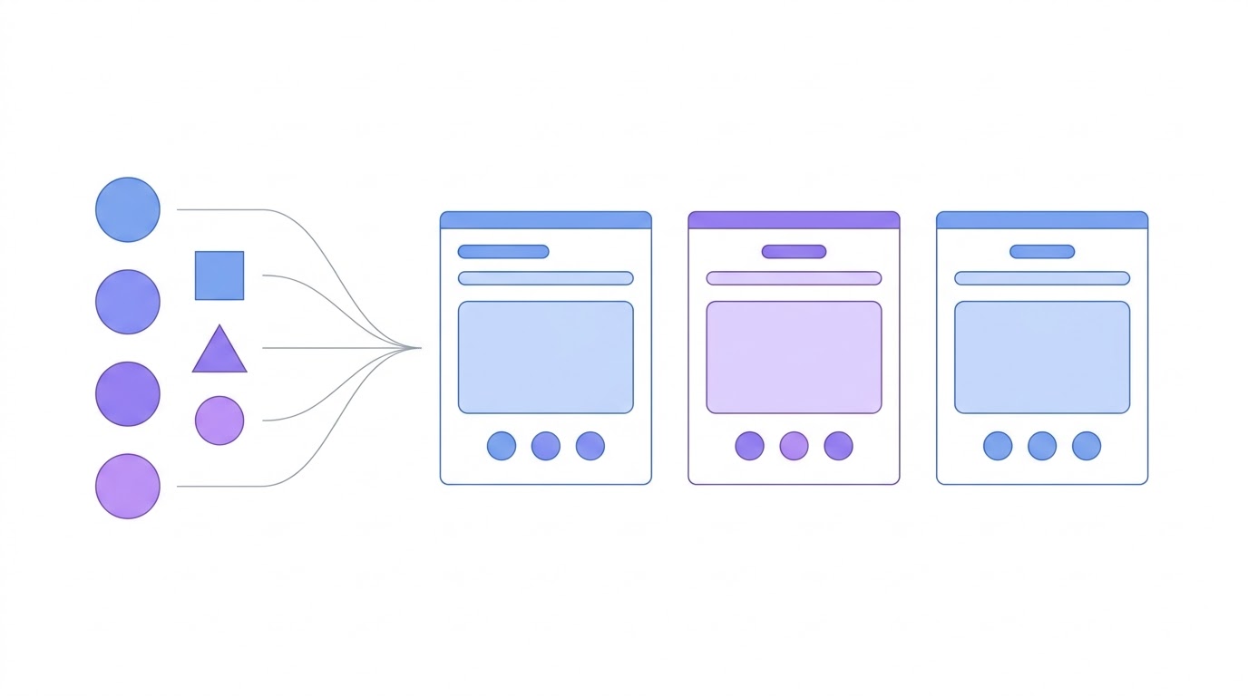
Brand books are usually written for the website, presentations and print — email is almost never covered separately. As a result some rules work as intended in the inbox, some need adapting, and some do not work at all. Here is what transfers directly, what has to be replaced, and how to define an email design system once so you never match colours by hand again.
Why you cannot simply reuse the website rules
An email client is not a browser. It limits the supported property set, substitutes fonts, and in dark mode may invert your colours on its own. A brand rule such as "headings are set in the brand typeface with minus two percent letter spacing" becomes a wish in email: for half your recipients the font will be a system one.
- custom fonts do not load everywhere and fall back to system faces
- thin weights read poorly on mobile screens
- light grey text on white can become unreadable after dark mode inversion
- brand corner radii do not render in classic Outlook without extra code
- background images are not supported by every client
What transfers directly
The good news: the core of a brand identity moves into email almost intact. That core is the minimum that makes an email recognisable.
| Brand book element | Transfers to email |
|---|---|
| Primary palette colours | yes, unchanged |
| Logo | yes, as an image with alt text |
| Tone of voice | yes, fully |
| Accent colour for buttons | yes |
| Container width | adapted: 600 pixels in email |
| Brand typeface | partly, a system fallback is required |
| Corner radii and shadows | partly, depends on the client |
| Complex gradients | usually not, replaced with flat colour |
What has to be adapted
Three parameters need a decision made specifically for email, and it is better to make it once than to argue about it in every campaign.
First, the font pairing. The brand typeface goes first, followed by a mandatory system fallback of similar proportions. If the brand is built on a condensed grotesque, a better fallback than Arial is something closer in width, otherwise the email will look foreign to a share of recipients.
Second, contrast. Light brand tints that sit comfortably on a website risk disappearing in email, because some clients invert colours in dark mode. Define a higher-contrast variant for body text in advance and check it against a dark background.
Third, behaviour on a narrow screen. Litmus data shows most opens happen in Apple Mail and Gmail, and those are predominantly phones. Fix heading sizes, spacing and button heights for mobile explicitly rather than relying on proportional scaling.
around 46%
Litmus: Apple Mail share of email opensHow to build an email design system
The point is to define a set of values once and then assemble emails from them, instead of eyedropping colours into every new layout. A minimal set looks like this:
- primary, secondary and accent colours
- email background colour and block background colour
- body text colour and secondary text colour
- button colour, button text colour, corner radius
- font pairing with fallbacks
- heading and body sizes for desktop and mobile
- spacing between blocks
- container width
- header and footer treatment
Once the set is defined, any new email is assembled from ready values. Changing the accent colour in the brand book recolours every campaign at once instead of turning into a manual pass through thirty templates.
Dark mode deserves its own section
Dark mode is where brand identity breaks most often. Clients handle it differently: some invert colours themselves, others respect your settings. A dark-mode logo variant, sufficient text contrast and transparent backgrounds on logo images solve most of the problem.
New Outlook adds a quirk of its own: it runs a post-processing pass after the email loads and rewrites styles inline, which can lose part of the styling. Developers recommend keeping the corner radius identical on all sides and avoiding background images.
I have also seen where my styles suddenly disappear from the DOM layout, and I find them rewritten inline.
How this works in Mailvex
In Mailvex a brand kit is not a document but a set of values applied to every block of an email automatically. You can upload a PDF and have colours, fonts, logo and spacing extracted from it, fill in a short questionnaire, or set everything by hand.
Any template from the library then recolours to your style in a single action. Teams and agencies can share brand kits: several clients, a separate value set for each, switching between them without rebuilding emails.
Upload your brand book and see a ready template recolour itself.
Browse templatesFrequently asked questions
What if there is no brand book at all?
Assemble a minimal set from what already exists: colours from the website, the logo, the typeface. That is enough to make campaigns look consistent. A full brand book can be written later; inconsistent emails are noticed immediately.
Can I use the brand typeface in email?
You can specify it, but you cannot rely on it. Some clients will load a custom font, others will substitute a system one. A fallback is therefore mandatory, and the email has to look decent either way.
How should an agency with several clients handle this?
Keep a separate value set per client and switch between them. The same campaign template can then be recoloured for any brand in a minute, without rebuilding the email.